We live in a world of color. For the most part, our lives would be very bland without them. From red stoplights to yellow caution signs and green lights that tell us it’s safe to cross the street, colors are everywhere. In fact, there is even an entire field of study called “color theory” which studies how colors interact with each other and their effects on humans’ moods!
There are many reasons to be interested in colors. We can use them to represent our moods, backgrounds, and emotions. Colors provide a way for us to feel more confident and better about ourselves when we look at things that enhance who we are as individuals. The color you wear or the paint on your walls might not matter so much if it doesn’t make you happy!
Colors can actually change the way you feel about something or make you react in certain ways such as feeling more confident or energized or making you hungry for food like blueberries because they look so good!
It’s impossible to ignore the importance of colors in design. Whether you’re looking for a logo or a website, color is an essential part of how your content will be perceived by customers and potential clients.
Table of Contents
What is Color?
The color of an object is determined by the light it reflects or emits. Objects also give off colors because they are heated, or cooled, so that their molecules change to become a different color. The wavelength and frequency of light determine what color we see objects as.
We are able to see different colors because of something called “wavelengths”. Wavelengths are a bit hard to understand at first sight; however, if you think of them like a wave it becomes much easier: red is just one type of wave that has a longer wavelength compared to other waves. Similarly green is another wavelength with shorter wavelengths than red.
You could even say that white is the combination of all these different types of waves. That’s why we see everything as white or grey when there isn’t any light hitting our eyes! So when you look at a red object, only the red wavelength will hit your eye. This is why we see objects as red!
A human being has three different types of cones in its retina (red, green, and blue). These are all tuned to different wavelengths so this means that we are able to distinguish between the colors.
Different Types of Colors
Primary Colors
Primary colors refer to a set of colors that are considered the building blocks for all other colors. These colors are red, blue, and yellow. They are called primary because they cannot be created by mixing any other colors.
All other colors can be made by combining different amounts of these primary colors. For example, mixing yellow and blue creates green, while mixing red and yellow creates orange.
Primary colors are essential in art, design, and printing, as they provide the foundation for all other colors used in these fields. Understanding the primary colors is important for anyone interested in color theory or creating visually appealing artwork.
Secondary Colors
Secondary colors are formed by mixing two primary colors together. The three secondary colors are:
- Orange: By combining red and yellow, we get the vibrant and energetic color orange. Orange is often associated with enthusiasm, creativity, and warmth. It can add a playful touch to designs and is commonly used to grab attention.
- Purple: Mixing blue and red results in the majestic color purple. Purple is often associated with royalty, luxury, and spirituality. It carries an air of mystery and can add a sense of elegance and sophistication to any design.
- Green: The combination of blue and yellow gives us the refreshing color green. Green is often associated with nature, growth, and harmony. It has a calming effect and is frequently used to represent environmentally friendly or sustainable concepts.
Tertiary Colors
Tertiary colors are formed by mixing a primary color with a neighboring secondary color. This results in a wide range of nuanced hues, expanding the color palette even further. Some examples of tertiary colors include:
- Yellow-green: This color blends the vibrancy of yellow with the freshness of green. It can evoke feelings of youthfulness, optimism, and renewal.
- Blue-violet: Combining the tranquility of blue with the richness of purple, we get the serene color blue-violet. It carries a sense of calmness and introspection.
- Red-orange: Mixing the intensity of red with the warmth of orange creates the captivating color red-orange. It can convey passion, excitement, and confidence.
Warm and Cool Colors
Colors can also be categorized into warm and cool tones based on their visual temperature. Warm colors, such as red, orange, and yellow, tend to evoke feelings of energy, warmth, and enthusiasm. They can create a sense of intimacy and grab attention effectively.
On the other hand, cool colors, including blue, green, and purple, have a calming and soothing effect. They are often associated with tranquility, relaxation, and stability. Cool colors can be used to create a sense of space and serenity.
Complementary Colors
Complementary colors are pairs of colors that are opposite each other on the color wheel. When used together, they create a strong contrast that can be visually striking. Some examples of complementary color pairs are:
- Red and Green: This pair, despite being opposite on the color wheel, can create a vibrant and balanced visual effect.
- Blue and Orange: The contrast between blue and orange can create a powerful and attention-grabbing combination.
- Yellow and Purple: When yellow and purple come together, they create a visually pleasing and harmonious contrast.
The Psychology of Colors
Colors have a psychological impact on our emotions and behavior. Understanding the psychology of colors can be valuable when it comes to marketing, branding, and design. Here are some common associations with specific colors:
- Red: Symbolizes passion, energy, and urgency. It can stimulate appetite and create a sense of excitement.
- Blue: Associated with trust, loyalty, and tranquility. It is often used by businesses to convey reliability and professionalism.
- Yellow: Represents happiness, optimism, and creativity. It can grab attention and create a feeling of positivity.
- Green: Symbolizes nature, growth, and health. It is often used in branding related to environmental or sustainable practices.
- Purple: Evokes a sense of luxury, spirituality, and creativity. It can be used to create a sense of elegance and sophistication.
CMYK vs. RGB
Being knowledgeable about what makes RGB and CMYK color modes different from each other is essential, especially if you are creating a design. This has to do with planning and optimizing your design. Knowing the difference is not just about memorizing its acronym meaning. It is about determining what it can offer to your project.
As mentioned earlier, CMYK and RGB are the two popular color modes when it comes to graphic design. If you are more on printed products, opt for CMYK color modes. On the other hand, if you found digital works are best for your design, consider using the RGB colors.
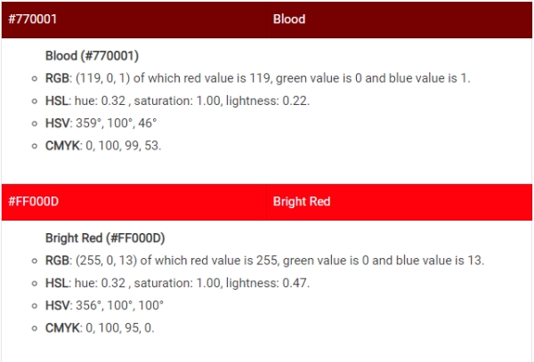
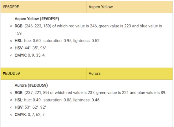
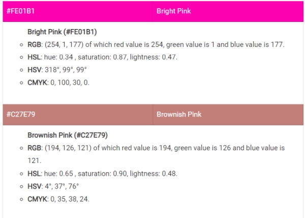
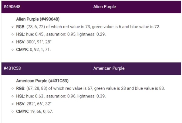
RGB is the abbreviation for the colors Red, Green, then Blue. As mentioned, it is a color palette intended for digital pictures. This color mode is recommended to use if your design will be shown on a screen, such as a camera, television, tablet, mobile phone, computer, and many more. Opt for RGB color mode if your graphic design includes visual content, social media posts, branding, and web and app design!
On the other hand, when we say CMYK, it stands for Cyan, Magenta, Yellow, then Key/Black. As stated, this is the recommended color palette if you are more on creating printed outputs. You can use this color mode if your design is intended to be printed. If you are planning to create or remake your past designs using paint or ink, the CMYK color palette will help you enhance its beauty and give you more precise outputs.
CMYK is a good color mode if you will create outputs for branding, advertising, merchandising, and other essential materials, such as product packaging.
Before you decide which color mode you want to use, make sure that you know what output you want to make. Is it printed? Go for CMYK colors. Is it digitally screened? Go for RGB colors.
Colors
Why Colors Are Important?
Many people may not think about the importance of colors. You might be wondering, “Why is this relevant to me?” Well, when it comes to color psychology, you can’t deny its significance! There are many different factors that factor into what a certain color does for an individual like their moods or how they feel on any given day.
For example, red signifies passion and love which could lead someone to have greater self-esteem during times when they need encouragement most. Color meaning affects everyone differently depending on who we are as individuals so take time in your life to consider these meanings before jumping right in with wearing anything new!
