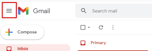
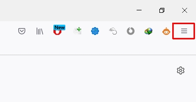
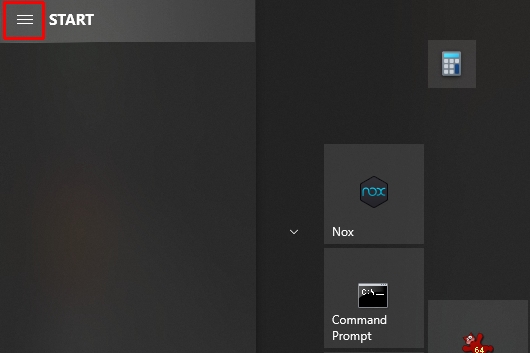
What is a Hamburger Menu? A hamburger menu, also known as an icon menu, is a type of navigation that replaces the standard drop-down or fly-out menus on websites. It’s called “hamburger” because it looks like a burger when you take off the top bun. The hamburger menu allows visitors to quickly access all of your website’s pages from one place without having to navigate through multiple levels in your site structure.
The hamburger menu, also known as the hotdog menu, is a multiple purpose button that provides program options if you are using your device in a cramped space or on the go. Many mobile apps use the hamburger menu to provide a streamlined viewing experience.

Table of Contents
The History of the Hamburger Icon
The hamburger menu, also known as the hotdog menu (because it looks like a hot dog), has been around for over twenty years. The first ever web page to use this type of UI was created in 1981 by Norm Cox.
The hamburger menu is a symbol meant to be easily recognizable. It was designed to be small and compact, so it could easily be seen. Three lines create the Hamburger menu that can describe the meaning clearly.
Not until smartphones and mobile apps became popular did the hamburger logo spread into mainstream culture. Websites on small screen sizes and mobile apps have very limited screen space, so they must use menus to keep their options hidden. The hamburger icon has become popular because it signifies that there is a menu where you can find more features.
What Is the Hamburger Icon for?
The hamburger icon has two main purposes. It can serve as a navigation for the page, or it can be used as an icon to signify that there is a menu with more options where you can find them.

The hamburger menu has replaced the standard drop-down or fly-out menus on websites.
This menu design can be found on many websites, mobile apps, and even Windows 10. It allows the user to quickly access all of your website’s pages from one place without having to navigate through multiple levels in your site structure, which can save them time.

It also provides a streamlined viewing experience for those using their device on-the-go or in cramped spaces by showing only what is necessary at any given time.
Hamburger Icon vs Kebab Menu
Some people believe that the Kebab menu is better than a hamburger icon because it provides more information without cluttering the screen. As a result, it’s easier to find what you’re looking for.
The Kebab menu has not been around for as long and may be less recognizable than the hamburger menu.


